I’ve been creating digital trading cards for about the last eight years. It started with challenging myself to create a set for my favorite film The Monster Squad, and then continued on sporadically while I ran my previous site, Branded in the 80s. My goal was twofold. One, create sets of cards for movies, cartoons or properties that never had them but should have, and two try to bring them to life in such a way that they look vintage (thinking about design and actual appearance here.) As much as I would have love to create actual, physical cards, I kind of felt like that was crossing a line in terms of doing these sets for fun, unlicensed. The price to print these kind of requires that you make enough to sell some to offset the price. And without a license it just seemed like opening myself up to problems. I even took a call with sales agent at one point to consider the feasibility of paying for the license, but though it was encouraging and seemed like a goal within reach, I’m not convinced that the non-sports market is robust enough to do much more than breaking even. It felt like a lot of extra work in order to hold a set of these cards in my hands.
But then, out of the blue a new opportunity opened up a little over a year ago when Terror Vision reached out about helping them with a small Monster Squad set. I wrote about that recently, and the post script to the story is that the Monster Squad set worked out well enough that they were open to working on more sets down the road. Well, the first project where I had a chance to collaborate with Terror Vision again came up towards the end of last year. They were working diligently to secure the original DAT tapes for the score of the 1986 cult horror flick Neon Maniacs. The movie is ripe for adapting to a trading card set because there are so many insane characters. For those unfamiliar, the film is about a handful of teens fending off against a large cadre of multidimensional killers that are wrecking havoc on the San Francisco Bay area at night. These twelve slashers are literal monsters that are based on killers ripped from across time. There’s a samurai, a hangman, a cro magnon ape man, a native American warrior, a medieval archer, and a leather clad biker just to name half of them. This is one of those films that I stumbled across when searching out “heavy metal” horror films in the wake of seeing Trick or Treat for the first time when we covered it for the Cult Film Club. I’ve been kind of mildly obsessed with it ever since because it’s just so weird. It’s one of those films that’s kind of horrible, but the more you think about it the more you want to revisit it. Multiple viewings just make this film better and better for me.

So when Ryan at Terror Vision asked if I’d be interested, I said “hell yes I would be”. I knew this set was going to be an important one for me because it was going to make a change in the way that I approach these trading cards going forward. In the past I had a pretty standard progression in my process for designing these cards. At the beginning I was literally scanning in vintage trading cards that had a similar design to what I had in mind for my set (like the card-fronts of the Dinosaur’s Attack cards for my Monster Squad set), and I’d change the scanned design about 25%-50% to suit my needs. Then as I worked on more an more of these I started challenging myself to get more creative. I’d still scan vintage cards, but mostly so that I could capture the textures of the cards to make my final set look like they were vintage. But more of the sets were full of wholly new digital designs like my Jem and the Holograms or Karate Kid sets. But starting with this Neon Maniacs set I really wanted to go a step further and work in actual hand-drawn illustration into the card borders to truly make these my own designs.
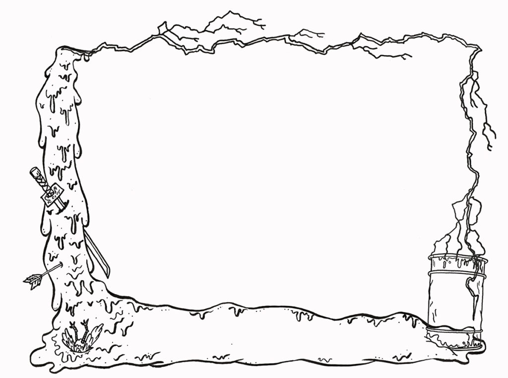
Here the three illustration elements are combined to make the border, though it’s messy as it hasn’t been cleaned up digitally yet.
So I did some brainstorming, re-watched the film like four times and came up with an idea for the card borders that I thought would be fun. In the film, if you get the Maniacs wet they start to disintegrate and they leave puddles of neon green slime behind in their wake. There’s also one of the Maniacs, Juice, who can fire electricity from his hands, so I took these two ideas and thought it would be fun to create a border illustration that heavily featured slime and lightning. I measured out a size that was a decent ratio for a trading card blown up about 300% and then broke down the illustration into three parts, the slime, the lightning, and a radioactive barrel to use as a space to add numbering to the cards. I did two variations of the slime, one for horizontal cards, and one for vertical, and added different details to differentiate them. I knew I could re-use the barrel on both versions of the cards, and I figured I could rework the lightning in Photoshop to accommodate both.
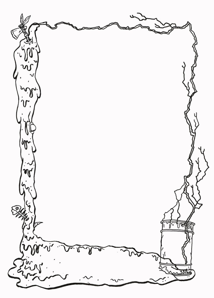
With the horizontal design I worked in the weapons of the Samurai and Archer as well as adding a dead pigeon (which is a weird plot point in the film.) On this Vertical piece I added Mohawk’s tomahawk and a dead fish (a nod to the damage water causes the Maniacs.)
There’s definitely some overlap in the separate elements of the illustration, all of which I cleaned up in the final card designs. But I was pretty happy with where the design of these cards was going and I think it’s going to be hard going forward to not hand-illustrate the borders. The next step was all about picking colors and deciding the level to which I would augment the line work digitally to create a stronger design. Here’s what I landed on…
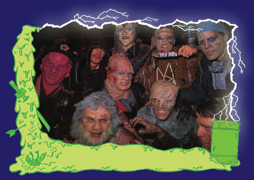
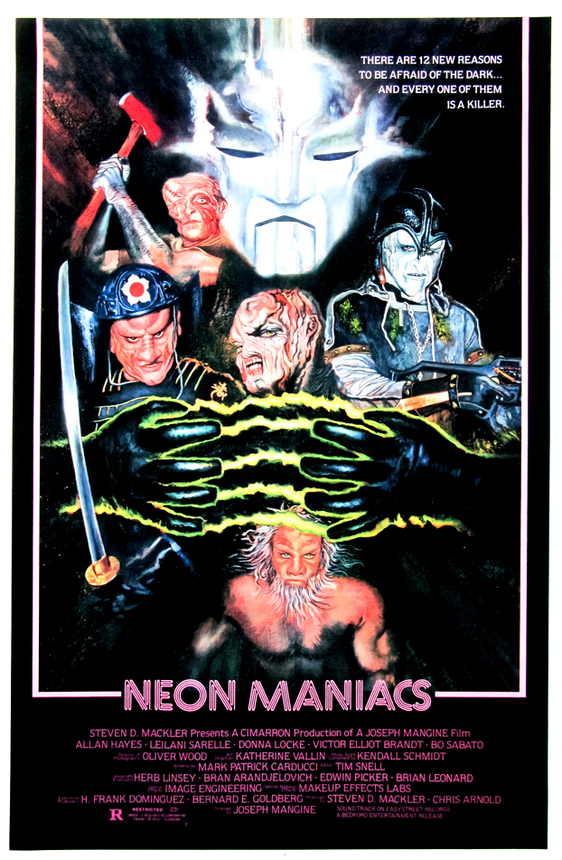
My idea was to keep the all of the slime green, including the details and line art. Then to really drive home the lightning effect by keeping that line work all white with an outer glow. I also wanted a darker color to offset the brightness of the multidimensional slime and the lightning, so I went with a dark blue with hints of deep purple. I pulled that color scheme from one of the one-sheet posters for the film I featured above.

Is there a lot going on in the design of these card-fronts? You betcha. And it was totally on purpose to reflect the insanity in the film. I wanted a slightly cartoonish feel to the design as well to reflect that aspect of the movie. Was it successful? Hell if I know. Like any artist or illustrator there are a bunch of things I’d change or add now that I’ve had some distance from working on the set. I think I would have tried harder to work in more weapons of the Maniacs for sure. But I was pretty happy with how these came out. All that was left after this step was picking out 40 images or scenes from the film, writing slightly quip-y titles and then designing the card back and writing 40 pieces of trivia. I’m a big fan of featuring trivia and observations on the backs of the card sets I create. It was common for Topps to uses this space to serialize the plot of the film or to just give a brief description of what was on the front, but I feel these days it’s cooler to take a deeper dive into the film. I feel like it really makes the set memorable, and informative.
![]()
I’ve always completely designed the back of the card sets I make from scratch, and they usually have this kind of similar format. I thought going with with slime green as the general background color was the way to go as well (both tying into the front and also offsetting the dark blue/purples of the front border.) The “Fun Facts” for this set were mainly mined from a 50% mix of observations from watching the flick repeatedly, and 50% from the single Fangoria article on the film before its release back in 1986. I did my best extracting the facts from the Fangoria piece and then reworking them into the context of the imagery on the card-fronts. It was kind of hard to nail down 40 pieces of trivia, but I managed. This is one of those films that really doesn’t have a lot of information floating around about the production or the actors. The main writers and filmmakers have either passed away or left the business years ago, and there isn’t a robust collector’s community out there digging up stuff. I actually ended up submitting a bunch of the cardback info to the IMDB page for the movie since it was so sparse.
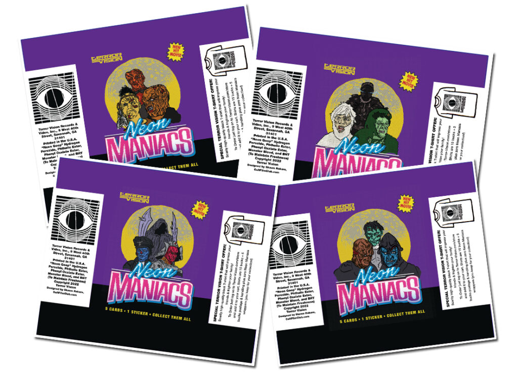
I also went the extra mile and fully illustrated four different wax wrapper designs (I typically use existing artwork filtered on top of cleaned up scans of real wax wrappers to achieve my digital wax wrapper imagery.) This way I could feature all twelve of the Neon Maniacs across the four packs. In addition we decided to include a sticker in each 5-card pack so I designed eight of those as well.
Overall, I was really excited about working on this set and feel like I did a decent job of creating something that I hope fans of the film will dig. I just recently got my hands on the final printed set and it was really trippy to open the wax packs and put the cards into collector’s pages.


Really hoping that I get to tackle some other films in the future, but regardless I’m stoked to enter into a new creative phase in creating these sets.