Since starting Plastic Rocket Pop, I’ve wanted to dig into my creative process when it comes to design and illustration as it’s not something I really talked much about when I ran Branded in the 80s.. While I’m a hobbyist at best, I still really enjoy drawing and coming up with ideas to help brand the projects I’m working on, and I thought it might be fun to look back at some of the illustrations I’ve done that I’m proud of. The Cult Film Club was born out of the idea of creating a network of podcasts that were tertiarily connected to the Atomic Geeks show back in the day. The Atomic Geeks heavily influenced the Nerd Lunch folks to start a podcast, and after a year or so in, they kind of grouped together and decided to try and launch a network. I was already podcasting, mainly making solo shows for my old site Branded in the 80s and working on the Saturday Supercast with my friends Jerzy Drozd and Kevin Cross. I was sort of in a lull in working on those shows when my good bud Paxton (one of the at-the-time co-hosts of Nerd Lunch) approached me about doing a satellite show for the Atomic Geeks Network. We decided on doing some sort of movie-centric show and then we sought out a third co-host, Jaime Hood, who I’d guested on other shows with. We put our brains together and landed on the idea of doing a show about cult movies, and after throwing out a bunch of different show titles we all agreed on the Cult Film Club as a fun one. So, in the fall of 2012 the CFC was formed.
I sat with this idea for a week or so and started to try and figure out what the branding and logo might look like. I did what most folks probably do when brainstorming ideas, I started writing down lists of things that reflected Cult Films for me. VHS tapes, movie projectors, 35mm film strips, movie ticket stubs, DVDs, 35mm film canisters, neon signs, theater marquees, popcorn buckets, etc. But I also started thinking about the club aspect too, and what could be cool to integrate into the logo or branding that reminded me of rad clubs. Wooden signs with childishly painted words, the Misfits Fiend Club, ramshackle wooden clubhouses, tree houses, the Famous Monsters of Filmland Club badges, the Burger King Kids Club, and stuff like that. I knew i wanted to do something a little dark or edgy, with some element of danger, but I also wanted something that was bright and colorful. Not going to lie, the movie Drive was on my mind a lot at the time. I was also in the middle of a deeply nostalgic time in my life, and I’d been listening to a lot of Metallica and curating a digital collection of a lot of the artwork related to the band, much of which was by the artist Pushead (Brian Schroeder). Schroeder’s artwork had a very big impact on me growing up, in particular the way he illustrates skulls, and his aesthetic was on my mind when dreaming up the logo for the Cult Film Club. I knew I wanted to work a skull into the logo but wasn’t sure how. Would it be part of the font, like the dot in the “I” of the word Film, sort of as a reference to the Goonies logo? Would it be more front and center like the Misfits Fiend skull head? Would it be a ghoul with a skull head watching a film on a CRT TV?
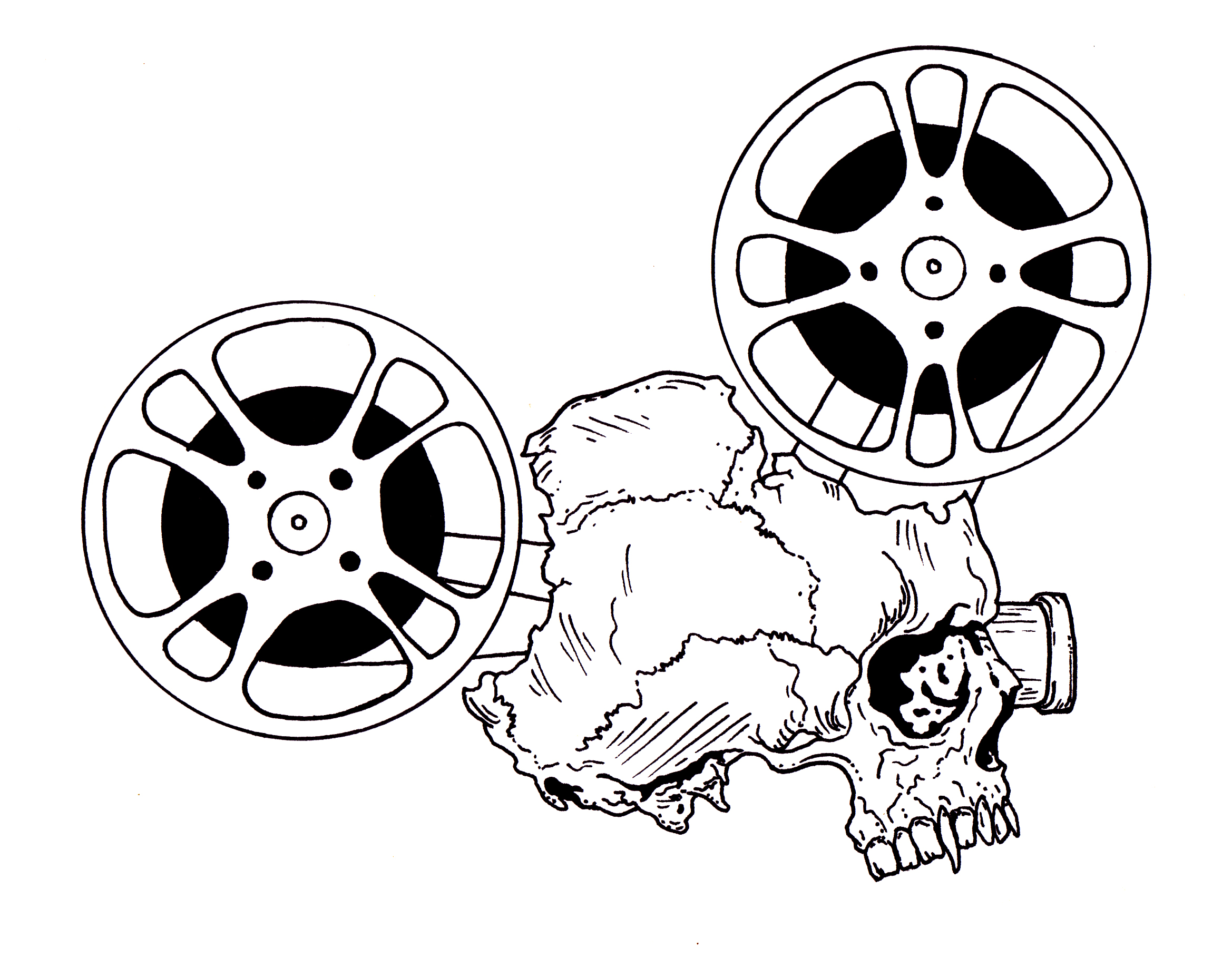
In a lull at my day job exactly 12 years ago (on November 8th, 2012), I was sketching out some ideas when it all came together like a lightning bolt striking me. A film projector, except instead of the normal projector motor/body it would be a skull! The reels would have smashed out of the top and back of the skull and there was a projection lens in one of the orbital cavities. I could see the logo clearly in my head as if it were an illustration by Pushead. I quickly flipped to a new piece of Bristol board in my drawing pad and roughed out the idea…
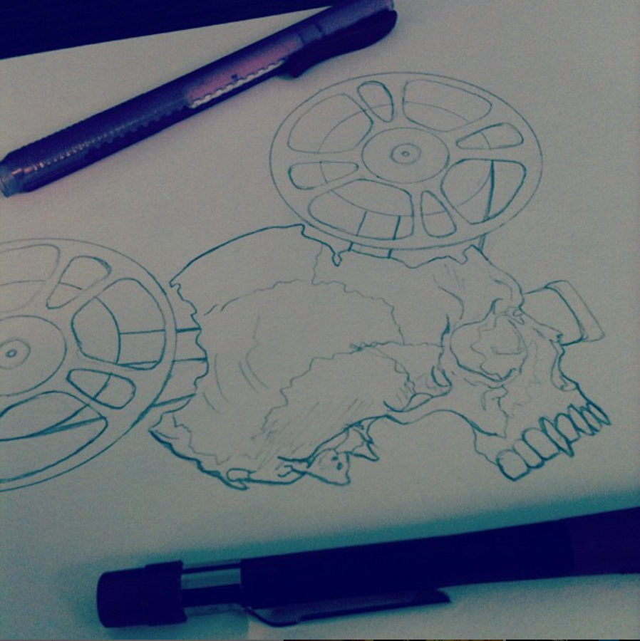
The only picture I have of the initial pencil drawing from when we as a society were using way too many filters on Instagram…
It’s rare for me to have such fully formed ideas in my head like this, so the actual penciling process was a whole lot easier for me than it typically is. I usually have a rough idea in mind and I end up taking a stab or two at broadly sketching out the concept, before looking for some image or object reference to guide my idea to fruition. This time though it was formed enough that I only did some cursory google image searches for the details of exactly what a projector reel looks like (how the holes in the metal are placed for instance) and the realistic placement of the bones of the skull. I wanted the skull to be a mix of Pushead fantasy with some of teh detals, but with an overall with realism so that it looked like some gross artifact pulled from a twisted crime scene. I also didn’t freehand the overall circles of the reels, I think I traced the rim of a large cup on my work desk if I remember correctly.
Now the pleasure that I derive from the illustration process is not in the penciling, but instead in the inking. Sometimes I’ll even challenge myself to not get too detailed with the initial pencils, I just use that time to rough out the general shapes and maybe some light outlines where I want deep shading or shadows to fall. But as soon as I put away my trusty Pentel 0.9 mechanical pencil and break out the Micron brush pens and 0.8 fine point pens is when I really start to love the process. Being able to fix issues I see in the pencils, the satisfaction of tracing directly over my pencil lines, and adding in all the little details is so much fun for me. It’s also where I feel like I can add a little bit of life to the drawing because my pencils tend to be pretty mechanical with little style or flair, but I let the inks feel more organic and not so rigid. This is where the piece either comes alive for me or dies on the vine.
With this part finished, the next step was to figure out where to put the text portion of the logo and how I wanted to preset it. To do this I traced the overall shape of the skull projector onto a piece of typing paper and made a bunch of copies so I could fart around with ideas on placement or design. I want to say that in doing this, it was not lost on me that there’s basically a hidden Mickey in the shape of the logo. And when you add the word “club” to the mix, well, evil Mickey Mouse Club anyone? Here’s some of the ideas I came up with…
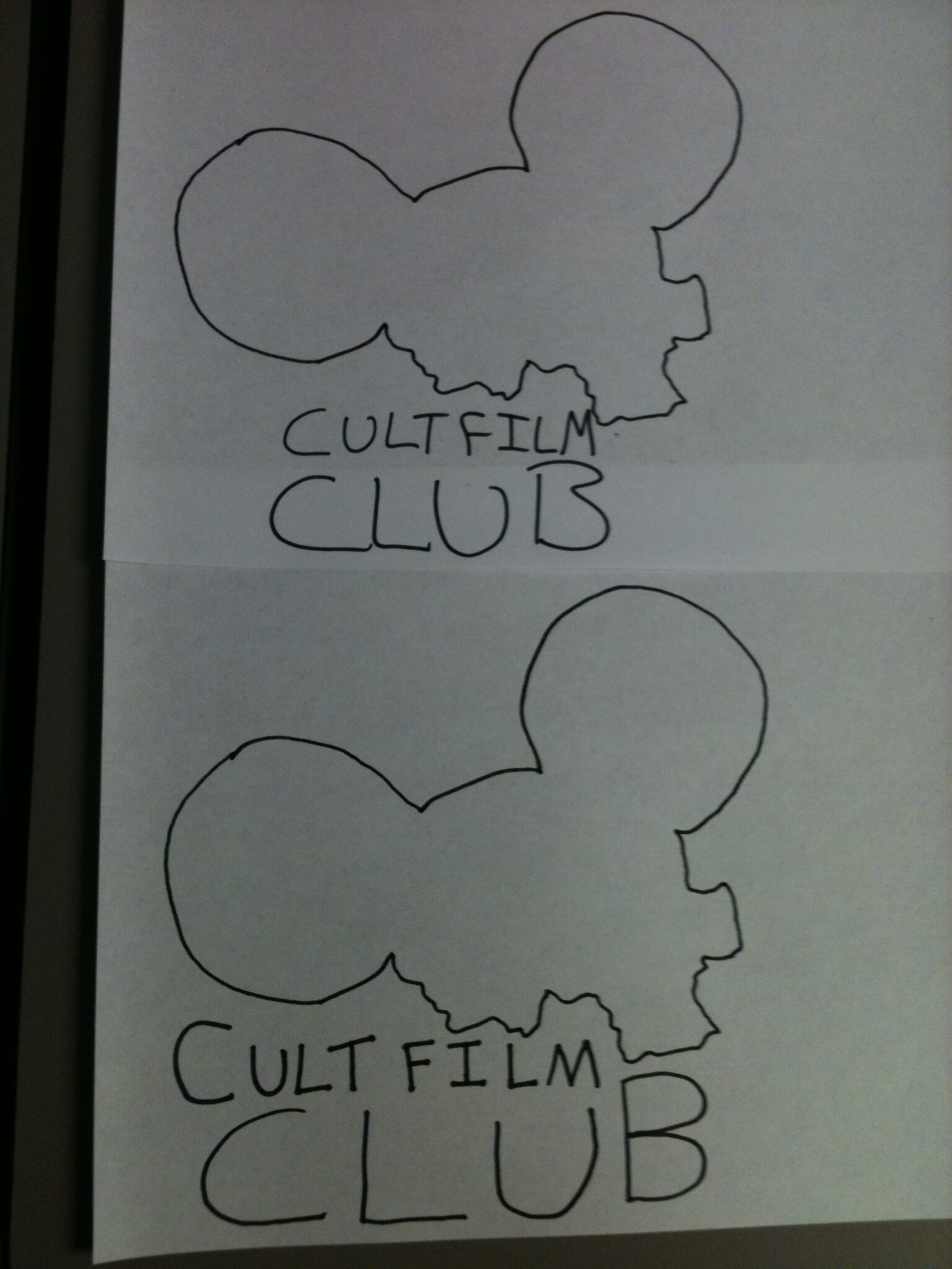
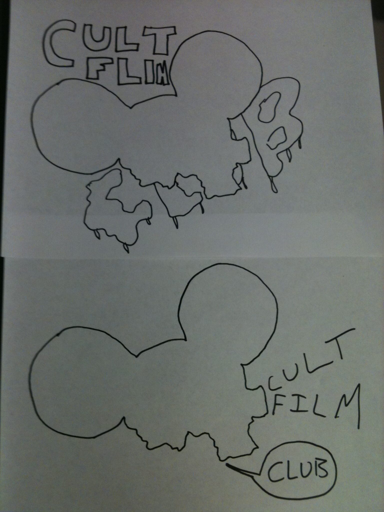
My first thought was creating a stack with bold block lettering, almost like the skull projector was sitting on a pile of VHS tapes. I also though that maybe the text should hug the overall image somehow. Of course then my mind went to bloody/slimy fonts, or something kind of comic-book-influenced with word bubbles. This last one gave me the idea to have the projector lens actually projecting the text portion of the logo, which is what’s in the final thumbnail above. When I did this I knew I’d landed on the best idea.
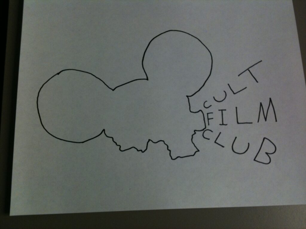
But I wasn’t sold on the literal projection part yet. So I did one last mock-up which was to go with a sort of ransom note aesthetic to the logo…
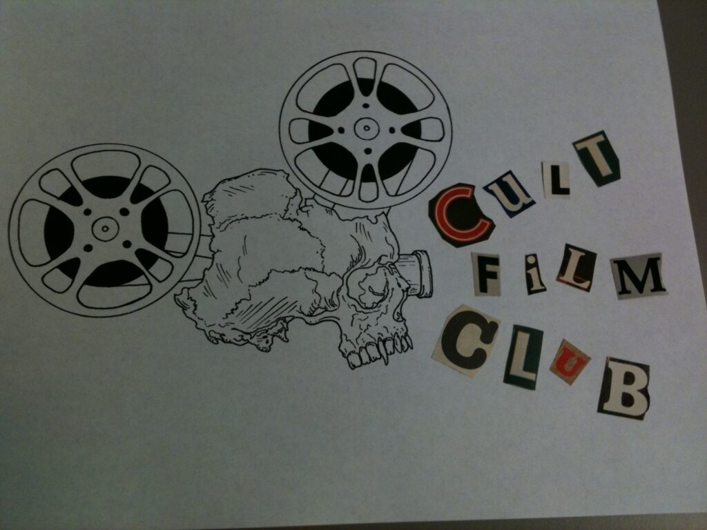
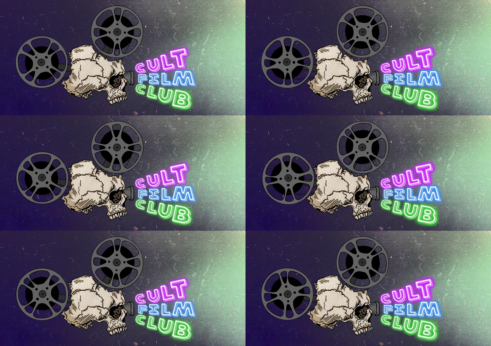
I pretty much knew as I was cutting out the letters that this was a dumb idea and super derivative. But there was some inspiration in the “C” I found for the work Cult. I liked the kind of neon sign effect of that cut out, so I decided to run with that and to have a the CFC title be in neon sign letters. But before I figured out exactly how I would do that I wanted to get the skull projector colored in Photoshop so that I could get a better feel for the finished look of the piece before landing on the final design of the text.
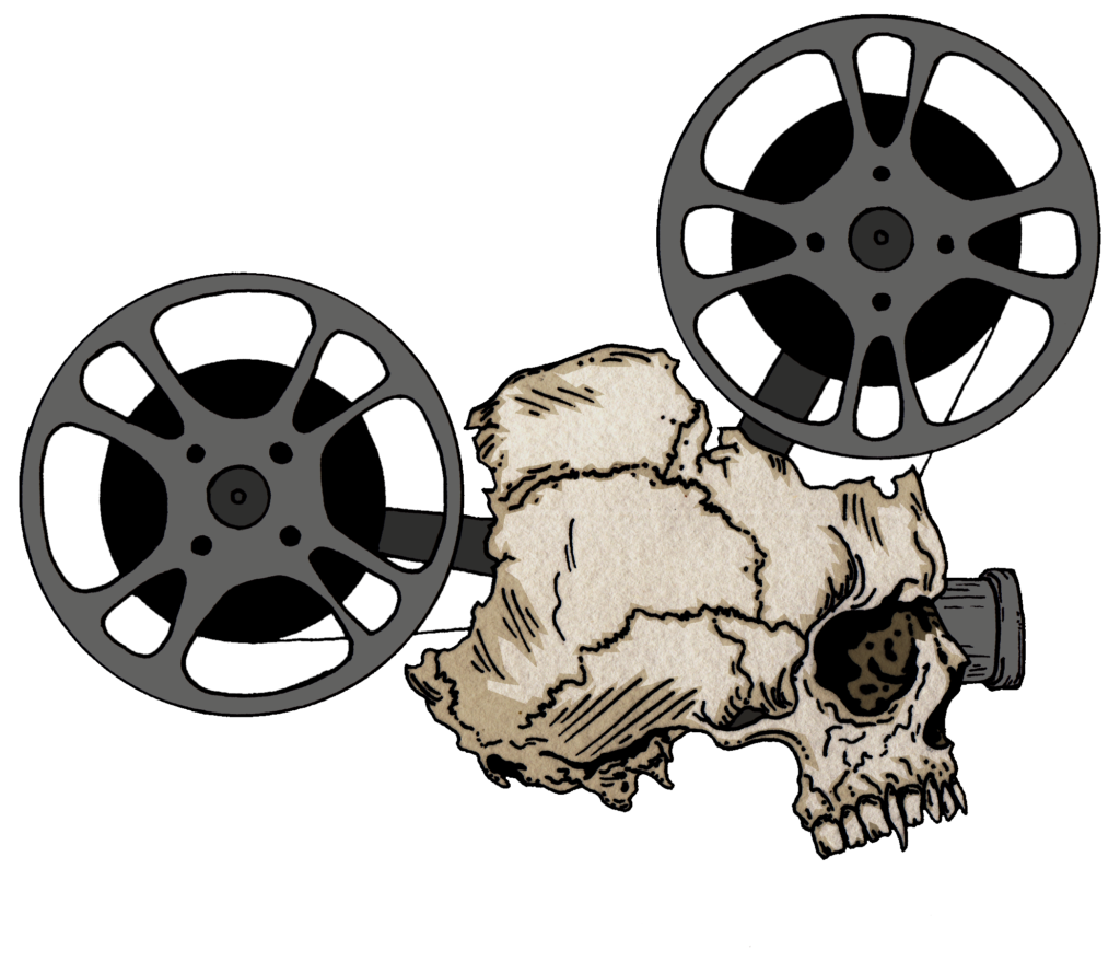
I didn’t get too fancy with the color, sticking with some flat greys for the projector pieces and tans and browns for the skull. One thing I did decide to do though was to keep and augment the tooth of the paper on the skull portion of the drawing after I scanned in my inks. I typically remove all of this texture and make the whites stark white when scanning in my drawings, but this time I thought that texture added nicely to the realism of the skull.
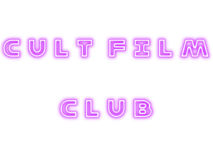
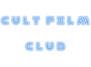
When it came to choosing colors for the neon sign font I was torn. I liked the idea of hot pink, electric blue and lime green, but I couldn’t land on a color that felt right. Each one was great, but individually they seemed a bit off. It’s like they overpowered the skull projector drawing because there were so garish and bright. But then I figured why not just do all three. I was a little worried that it would have too much of a rainbow feel to it, but the three colors blend nicely with each other and stick on the cool side of things (eschewing the warmth of red, orange, and yellow), so it was only half a rainbow. When I placed them with the illustration I decided to double up and layer the font as it was a bit too flat when I first added the text in Photoshop.
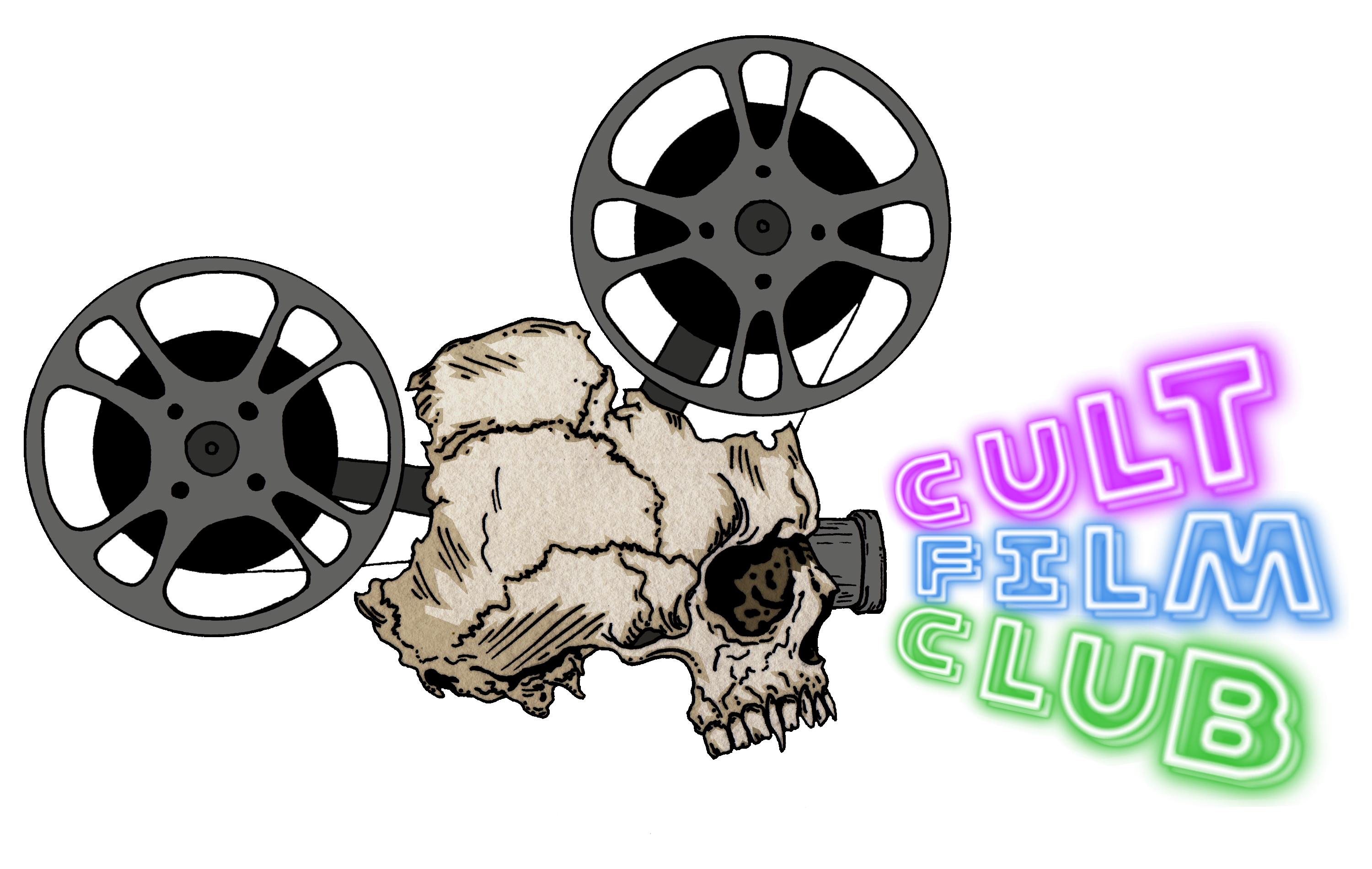
Is this logo perfect? No. But do I love it? Yes. I know that might make me sound a little full of myself, but I was very happy with how this turned out. In fact, after 12 years I’m still in love with this design, which is not something I can say about much of my art and design work.
For one last bit of fun, when we were redesigning the site after moving hosts about five years ago, my wife Jaime (who built the Cult Film Club site and is one of my co-hosts on the podcast) asked me to try and create an animated version of the logo for the new site. Never one to back down from a creative challenge even when I don’t have the necessary skills to accomplish the goal, I did a bunch of research on ways to make animated gifs in Photoshop and proceeded to create the following…
Again, not to pat myself on the back too hard, but I think it came out pretty dang fun.
