A few years ago the Mountain Dew brand went through a fairly massive overhaul of the visual design used on their cans and bottles. It started with the introduction of a handful of exclusive flavors available at retailers and restaurants (like Sam’s Club’s Berry Monsoon, Bojangles’ Southern Shock and KFC’s Sweet Lightning), which were a reaction to the popularity of the collaboration with Taco Bell on the Baja Blast flavor. These and a series of limited edition flavors in the Game Fuel series led to the brand introducing a lot of revolving flavors that pop up at retail annually. This shift to limited edition soda flavors was really helped by the launch of the first one that really hit a home run with a brand new design aesthetic, Mountain Dew Voo Dew in 2019. Voo Dew is a Halloween-candy-inspired concoction with a mystery flavor and a hooded, Grim Reaper-like, character as the mascot. This illustrated Reaper character featured very prominently on the can and bottle labels and was a dramatic shift away from the geometric and tribal tattoo designs the brand had been leaning heavily on for almost 20 years. This personification not only added heavily to the mystique of the flavor, but it added a unique playfulness that had been missing from soda can design for almost 30 years.
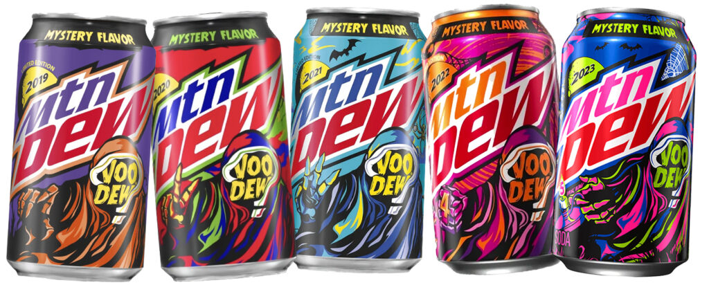
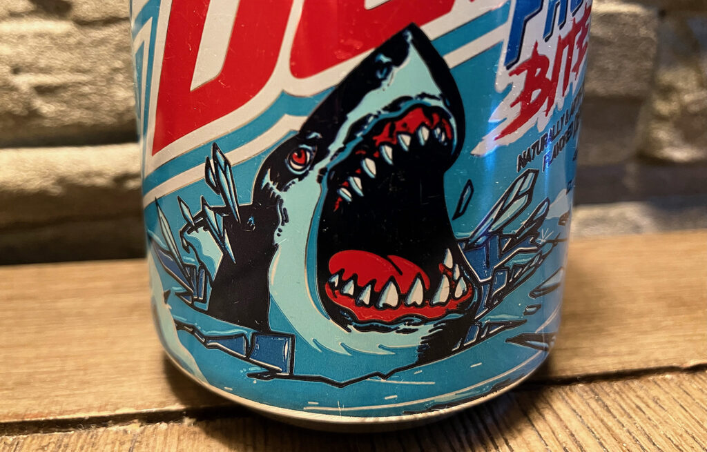
The following year Mountain dew began to lean heavily into this new illustrated monster aesthetic with all of their new limited edition flavors regardless if they were released around Halloween or not. First up was the Wal-Mart exclusive Frostbite featuring a ferocious great white shark attacking a frozen tundra on the wraparound artwork. There is so much that I love about this can design from the gnarly shark drawing to the fact that the designers utilized a red, white and blue color scheme that doesn’t evoke American patriotism in the least (an amazing feat in my eyes.) The energy in the art plays so well with the giant Mountain Dew logo (smack dab in the middle of the can) as well. It really is a thing of pop art beauty. Also in 2020 a second Voo Dew mystery flavor was released, solidifying the tradition of a new Halloween candy soda variety for years to come.
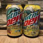
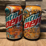
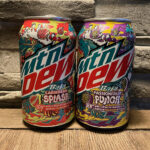
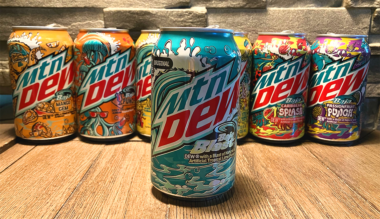
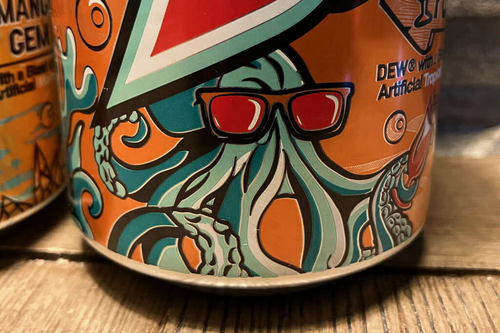
Then in 2021 the brand expanded on their annual re-release of Baja Blast to retail during the summer months to include two new Baja-inspired flavors, Baja Flash and Baja Punch. Though the base Baja Blast cans received an upgrade to their design, switching from a rather boring empty teal can to one featuring a giant curling wave, the real stars were the aquatic monsters featured on the Flash and Punch cans. Baja Flash, a Pineapple flavored variation, features an echo of the wave, but also includes a giant, fanged eel wearing a lay and donning heart-shaped sunglasses. The artwork also features illustrations of a hermit crap with a pineapple shell, a great white shark (also in shades) and an antiquated deep sea diver that would carry over into the design of the following year’s Baja Gold (a new pineapple variation.) The artwork is mainly yellow, red and teal, though yellow takes center stage. Baja Punch, a tropical punch flavored variation, also features the giant wave and is adorned with illustrations of giant squid, jellyfish and an octopus. The overall color is orange, but it features red and teal heavily, and the cephalopod-centric imagery is carried forward into 2021’s Baja Mango Gem.
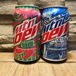
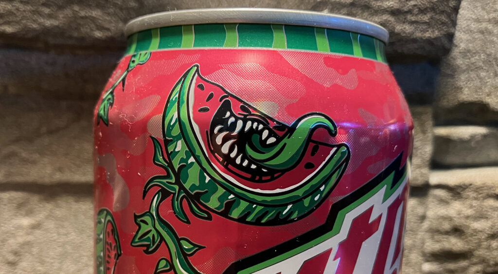
2021 was a banner year for new monstrous Mountain Dew designs as we saw releases of Voo Dew 3, the first in a new line of Christmas-themed Dews (Gingerbread Snap’d), the new permanent flavor Major Melon, and the Kroger exclusive Thrashed Apple. Of course Voo Dew 3 saw the return of the mystery flavor and the Grim Reaper (this time with a primary color theme leaning hard on blue and yellow.) But the real stars here are the anthropomorphized apples and melons. Kroger’s Thrashed Apple has a can that is mainly green with splashes of red and brown, and features a two-piece, apple tree monster punk band. The artwork is fun, energetic and was the start of a motif where the designers would hide messages in the artwork either eluding to the Mountain Dew tagline (DTD – Do The Dew), references to the retailer (Thrashed Apple features a “K” for Kroger carved into the tree and an ’83 on the tree’s guitar referencing the year the store was established in 1883) or upcoming flavor releases. Major Melon features a mainly pink camouflage color scheme with grizzled, Vietnam era watermelon character amidst a series of barbwire vines sprouting sections of sliced watermelon creatures.
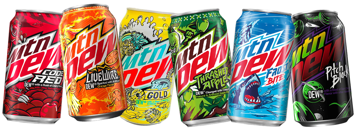
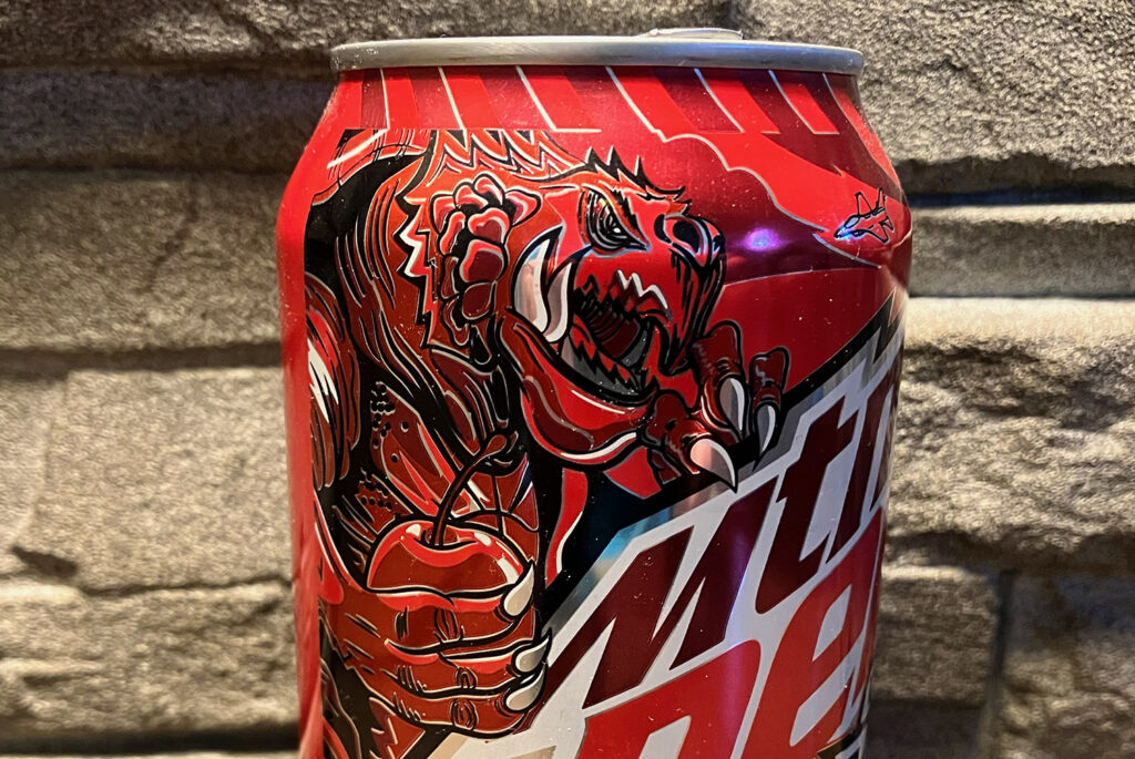
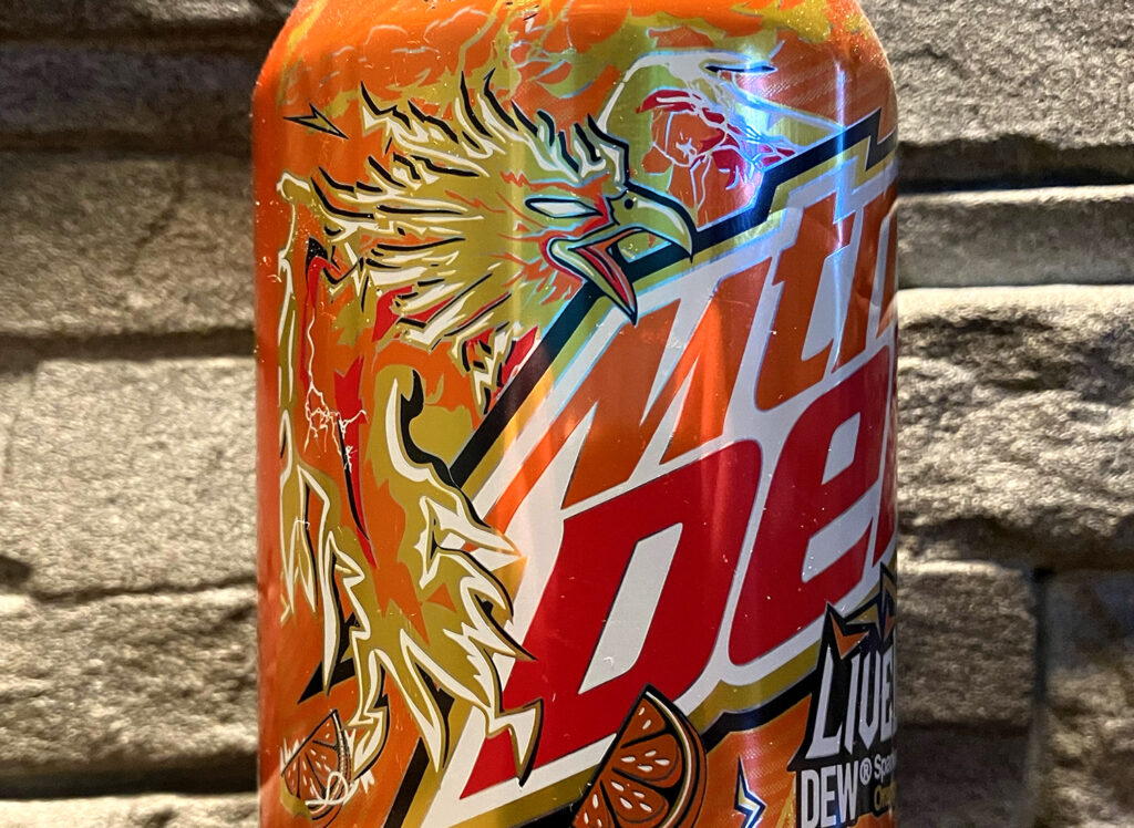
Again, the success of these new flavors and their heavily illustrated designs was apparent enough that at some point in towards the end of 2021/beginning of 2022 Pepsi Co. started rolling out new re-designs for the stable of existing, permanent flavor varieties like Code Red, Live Wire and Voltage. And then in 2022, every new or returning flavor also got this updated design treatment. Code Red shifted from the nuclear submarine radar motif to a giant kaiju turtle monster (in the vein of Gamera) attacking a metropolis with streets paved with large cherries. Livewire switched up from the electric shock design to that of a massive, winged cryptid thunderbird, flying in a storm of orange slices and lightning bolts. For those who aren’t up on their Native American or crypto-zoological lore, Thunderbirds are giant falcons with wingspans so large they can attack and carry off buffalo or elks; they have eyes that shoot lightning and when they flap their wings it brings the sound of thunder. Mountain Dew Voltage also switched up from a simple lightning motif to that of a crazed, cyborg mad scientist with electricity for hair doing weird, Frankenstein-esque experiments on raspberries.
As cool as the limited edition designs were, the fact that all of these staple side flavors were getting the monster treatment was what really got me stoked for the brand in the last few years. I adore horror/monster/Halloween culture as it is, and have had a soft spot in my pop culture heart for Halloween-themed designs on soda cans, so these new cans were amazing to me. I love when huge companies go in bold directions like this with their branding and this one speaks directly to my heart and my own illustration and design aesthetic. In fact, this got me so excited that I actually started collecting and displaying the cans in my home office. It’s gotten to a point where I’m actively searching for any news on supposed new flavors or regional exclusives that I can seek out and acquire for the collection. Some of these are extremely hard to track down as they might only be available in other countries. Though the price tag of some of the cans is hardly going to break the bank, so to speak, the idea of paying upwards of $50 for a single can of soda is antithetical to my sensibilities of responsible spending. I’ve decided to mainly collect the 12oz aluminum can varieties of these flavors as they display well and feature a much better, larger version of the artwork than the small, wrap labels on the 20oz bottles. But some flavors are mainly distributed in 20oz form such as the Circle K exclusive Purple Thunder. There was, however, a very limited version of Purple Thunder released in tallboy, 16oz cans in Canada, and a single can can fetch up to $40 on eBay. The thought of dropping that on a can of soda is a non-starter for me though.
Amid this who shift in the Mountain Dew design there is one big elephant in the room that I find very curious. With all of these new fun looks, there is one variety which has been omitted, keeping the same stale look it’s had for what seems like the last 15 years, and that is the flagship basic Mountain Dew. The green and silver cans with the floating geometrical icebergs were boring to me when they were first introduced, and are severely in need of an update in my opinion. Though I get that changing up that portion of the brand is the most risky for Pepsi Co, it’s still really odd that it’s the only variation in the huge cornucopia of varieties that is not in-line with the brand as a whole. What I would give to see a bold new version of the Mountain Dew hillbilly mascot from the 60s reimagined as a Toxic-Crusader-like figure with some sort of menacing bald eagle as a pet. It would be amazing.
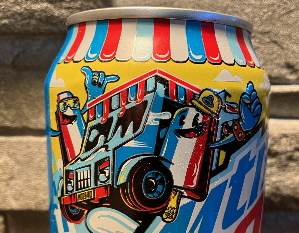
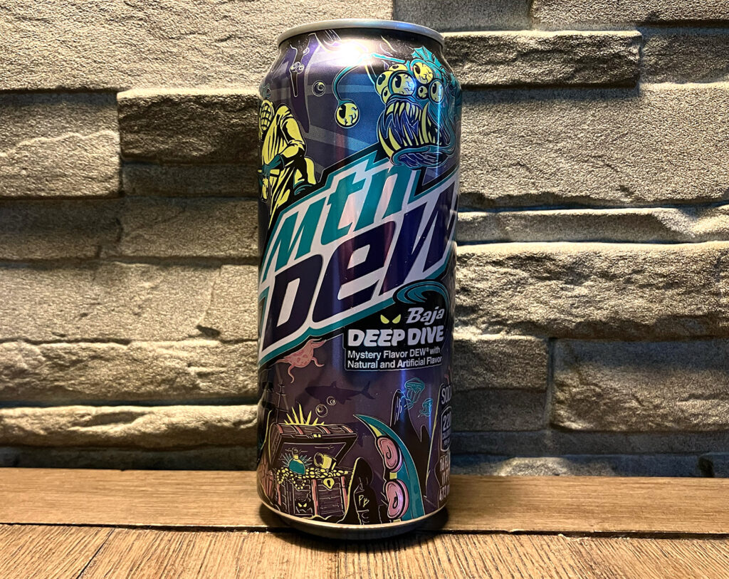
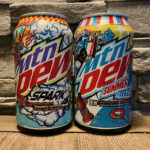
So far there have been 26 monster (or monster adjacent) new can designs including 3 Christmas cans, an exclusive Baja variety called Deep Dive (which was the award for the 2022 summer Baja Blast contest), a couple of summer summer-themed sodas (Spark and Summer Freeze), a re-design of the fan favorite Pitch Black (that eschewed monsters for a galactic planetary design), and a fifth version of Voo Dew hittingstore shelves right now. There are also some more regional exclusives including a Canadian offering called Honey Dew featuring a Pokemon-esque monster, and an as yet unnamed peach flavor for next summer. As far as collections go, this one is probably one of the more affordable ones as soda is still relatively cheap and it’s pretty easy to display the cans. I’m still holding out hope that in the next year or two we’ll see a redesign of the main brand to align with the rest of these badass cans.
