Do you ever just spend all your waking free time to obsess over redesigning your brand? No? Well, I do. Or did for the past 10 years or so. As much as I love my previous website (and brand) I was always a little unhappy with my attempt to design a logo. My original idea for the illustration for Branded in the 80s was a simple drawing of my head with a bunch of fun childhood pop culture sort of flowing out of my head like a bloody wound. When I designed it I was still in that phase of my illustration hobby where I never really did preliminary sketches to get my ideas out. It was all about racing to a finished piece whether or not the idea was solid or expressed well. I ended up with something that was fun but kind of abstract.

Anyway, fast forward to about 2012 and I was kind of having an existential crisis with the design of my site (having lived with it for half a decade already) and I started seriously thinking about how much the concept for the site had painted me into a corner. I felt like even though a lot of the design of the site was a part of me, it didn’t wholly reflect my aesthetic in quite the way I’d like. At that time I started a new podcasting venture with a couple of my friends (Paxton Holley and Jaime Hood) called the Cult Film Club. I took the reigns of designing the logo and this time I was very happy with the results. Not only did it nail the aesthetic of what I believed we;d be striving for in the podcast, but it also felt like it really reflected my personality. The “Skull Projector” just felt so perfectly me. Here’s the original illustration…
![]()
…and here’s the finished logo design.
![]()
Hitting that design squarely on the nail head made me really want to ditch the design of Branded so that I could retool my site to more accurately reflect who I am (I’m not just about 80s childhood nostalgia after all.) So years went by and I would constantly brainstorm for a new site name and a new logo. I just wasn’t finding that idea that floored me. That is until a couple of years ago when I was driving home during a commute from work when I switched gears from trying to figure out a fully formed website name to more of a word soup. What were some words or phrases that I found sexy and fun. The “Pop” in Pop Culture was the first word that I really wanted to use. so I started trying to figure out something that was fun that worked with Pop. Popsicle was a brand that came to mind, something that was sugary, fun and reflected my childhood a bit without being so blatant as evoking the specific decade. For some reason thinking about popsicles made me think of those Frozen Moments food sculptures by Geoffrey Rose from the mid 80s. I though about a melting popsicle, frozen in time and that kind of felt right. Those sculptures were made of hard plastic, so naturally “plastic” was the next word that kind of fell into place. I was going through the variations in my head, Plastic Popsicle, Pop Plastic, Melted Plastic Popsicle, Melty Pops, Plastic Pop, etc. I decided that Popsicle was out because it was a trademarked brand. But I also remember getting one of those feelings like a light going off in my head. Plastic Bomb Pop. Yes! There it was. It has the plastic representing a good portion of the junk I collect, as well as being playful, fun to say and evocative. Bomb Pops being my favorite frozen treat on a stick had the explosive quality as well as the irony of butting up against something fragile and plastic. And it just felt really fun to say, Plastic Bomb Pop. It has symmetry and alliteration, it was bouncy and kind of dangerous, yet still playful and weird. Just too perfect.
Of course, throwing this out to a couple of friends made me realize that as ubiquitous and generic as the phrase “bomb pop” seemed, it was also a trademarked brand. And apparently from a very litigious company to boot. But my bud Roger threw out a suggestion for an alternative. Plastic Rocket Pop. It still had the symmetry and alliteration, it was still playful, bouncy and weird. It was just 50% less dangerous. But I still loved it. So I bought the domain and started wracking my brain for an idea for the logo. After having so much fun with the Cult Film Club design, I really kind of wanted to incorporate a skull into the design. I’d also worked on another skull logo illustration that I loved but had no idea where to use, so I figured I’d start there. Here’s that second skull design…

In the case of this new site, I felt it was apropos to do something a little less “horror” and a little more “cartoon-y”. I also felt like It would be insane to not work a rocket pop into the illustration.So I sought out some clip art and stock photos online and mocked up this idea on my ipad…
![]()
The crux of this idea was to create an image that was also a hidden bit of wordplay. When I was first brainstorming names for what would become Branded in the 80s back in 2006, one of the phrases that I kept circling around was “brain freeze.” I grew up on Slurpees and Icees and I love the term brain freeze, but it never really clicked. So I thought it would be fun to revisit that in use this image to finally bring a “brain freeze” to visual life with the new logo. So, a skull stabbed through the eye socket with a rocket pop sitting in a pool of slime. I can’t explain why, but it feels perfectly me. So my next task was to translate this mocked up idea into a fully fledged illustration.
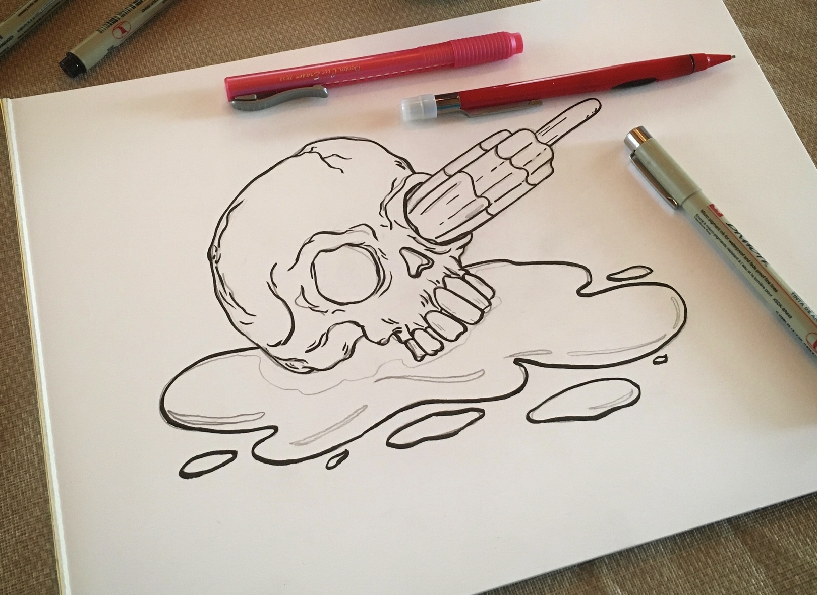
I was really happy with how this turned out. It’s gross and silly, weird and very pop art. Not only that but the rocket pop and the slime gave me an opportunity to work with my current favorite color scheme of hot pink, electric blue and lime green. Is it perfect? No. Does it accurately feel like me? Yes.
![]()