I always felt very lucky to have had access to cable television as a kid growing up in the 80s. Whether it was the fact that I had access to WGN so that I could be exposed to the Bozo Show (and more importantly the Grand Prize Game segments), Nickelodeon and the plethora of awesome programming on the network, or the handful of years when my folks popped for the extra $20 a month to subscribe to HBO. Home Box Office was chock full of really cool stuff back in the day, shows like Fraggle Rock, Encyclopedia, and the Buy Me That specials hosted by Jim Fyfe.
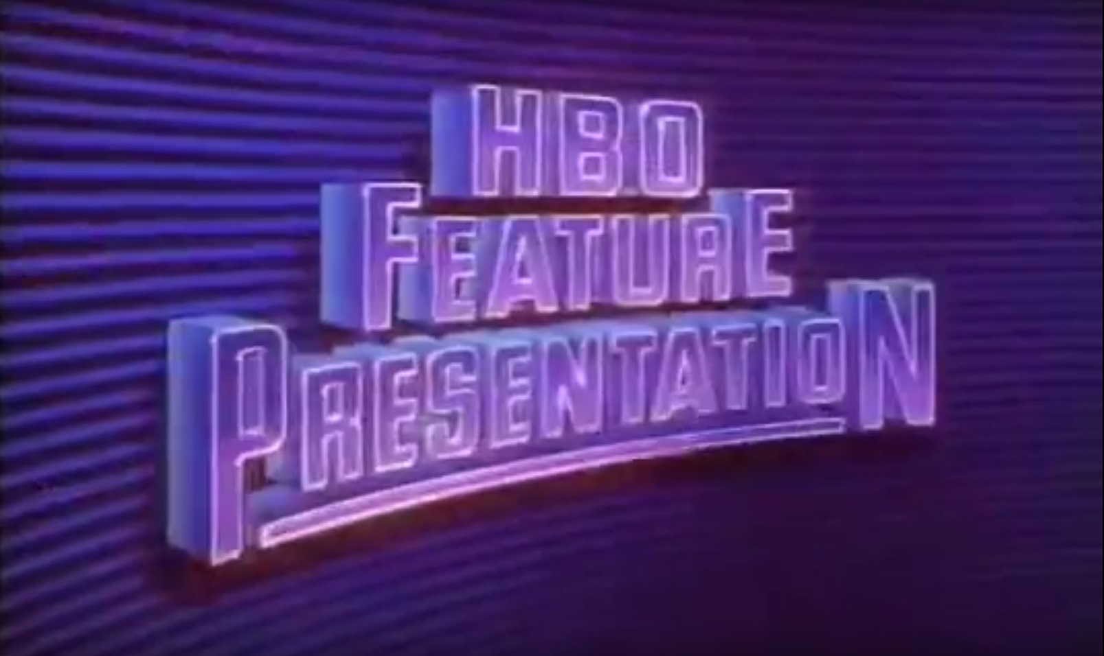
But hands down the single coolest thing on HBO was the minute and a half intro that played before all of the first run movies in the evenings. If you had HBO in the 80s and 90s you know the one…
This awesome Feature Presentation introduction with is bombastic score and its extremely 80s era effects work is one of those pieces of media that is burned into the memory of anyone who was subscribed during the decade. In fact there are some movies that I’ve watched a hundred times off of a VHS that taped from an HBO broadcast where this intro feels like it’s part of the film. Much in the same way that the 20th Century Fox intro feels like a part of the original Star Wars trilogy or the Tri Star Pegasus intro feels like a part of the Monster Squad, this HBO intro has become associated with a ton of films for me.
I can’t count how many times my co-hosts Paxton and Jaime have brought it up when we’re recording the Cult Film Club podcast, sharing memories of the films it played before and breaking down some of the little details (like how neat it is that the HBO logo is basically a space station beaming down movies to the earth below.) Yet, in all our conversations in never occurred to me just how detailed this short introduction really is. In fact, up until this past weekend I was under the impression that a portion of the intro, the HBO shaped space station/satellite, was a (literal) shining example of some early CGI animation. Turns out, not so much!
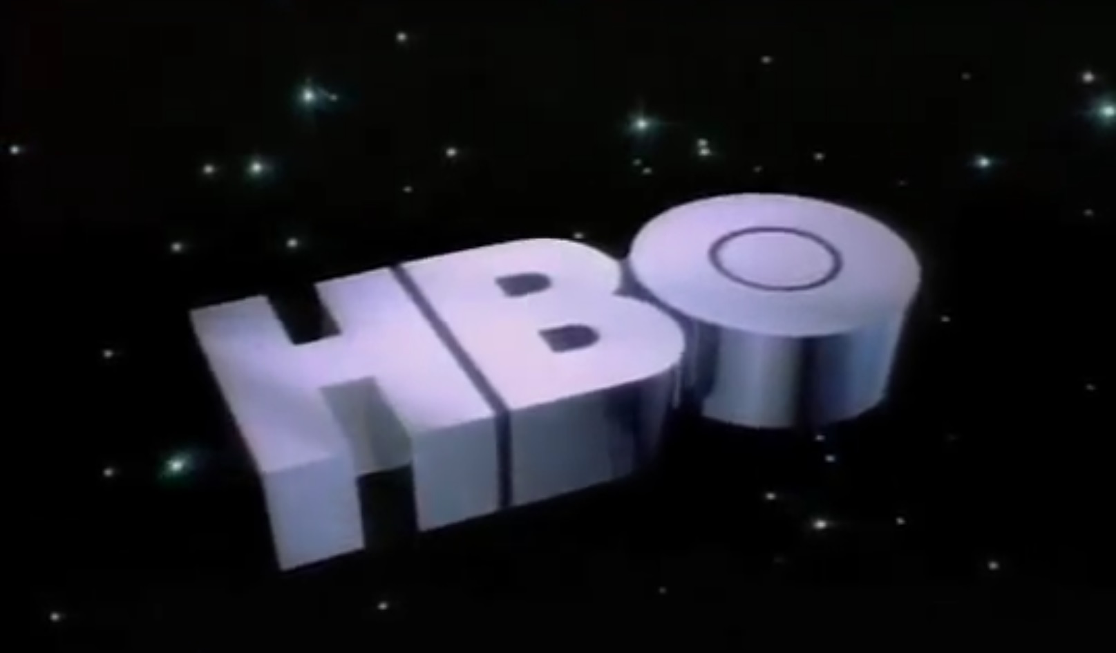
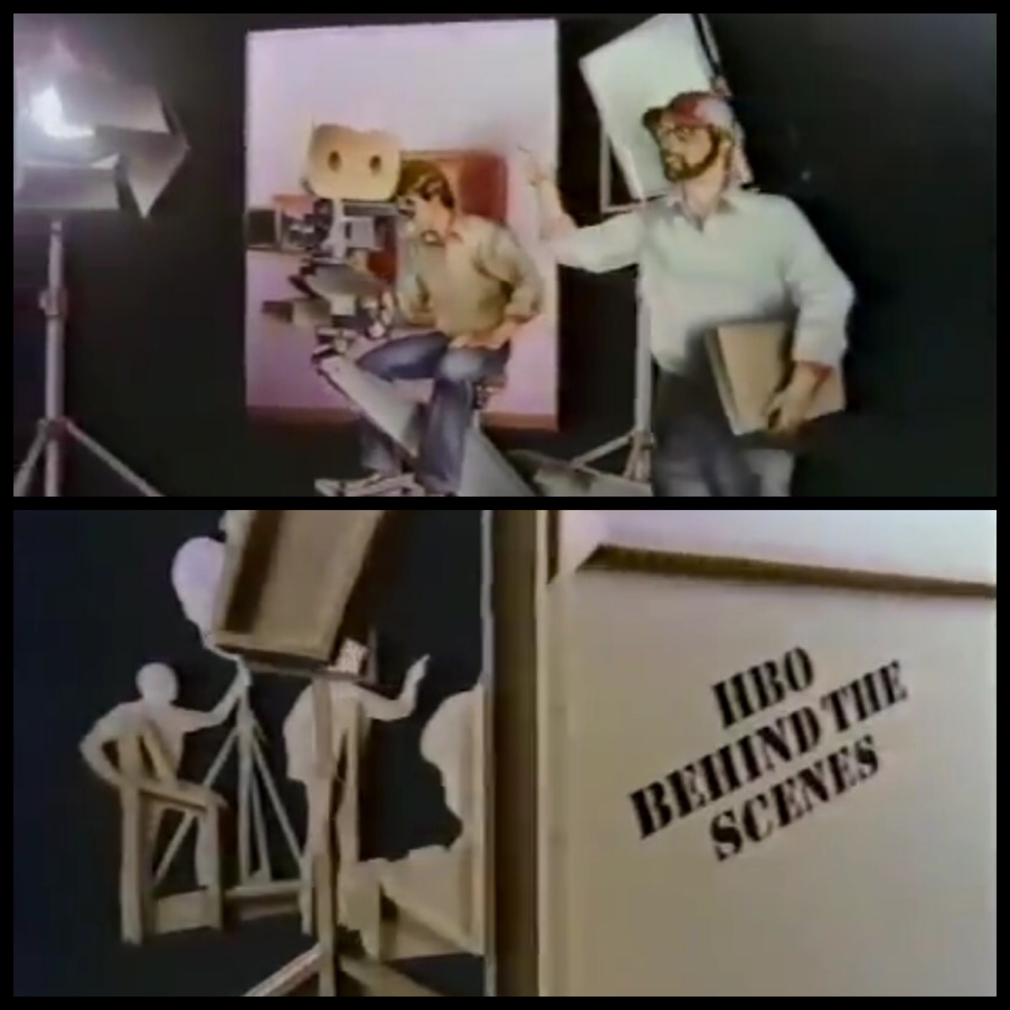
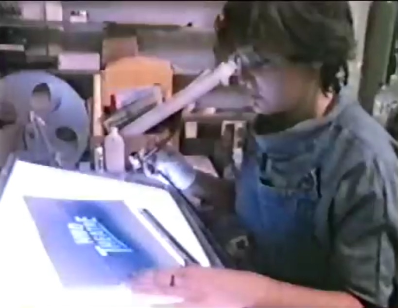
After falling down the rabbit hole that is youtube for a few hours I stumbled upon a pretty amazing bit of vintage HBO, a behind the scenes special on the making of the HBO Feature Presentation intro!
You know that HBO knew they had something special on their hands when they took the time to produce a Making-Of alongside the actual intro. First of all, I love that this short video exists because now I have some insight into who actually worked on the intro. Folks like that are usually the unsung heroes of pop culture because they’re working in a marketing capacity. I mean, show of hands, how many people can name at least 10 different Transformers characters from the 80s toyline? Most of you right? Now, how many of you can name at least one of the artists who painted box art for those toys? I’m guessing not nearly as many. This isn’t to say the we’re not interested in these artists, it’s just that there is almost no visibility into who these folks are. So after almost 30 years of loving this HBO intro, I finally get to learn who some of the folks are who worked on it, folks who’s art and talent have burned its way into my permanent memory.
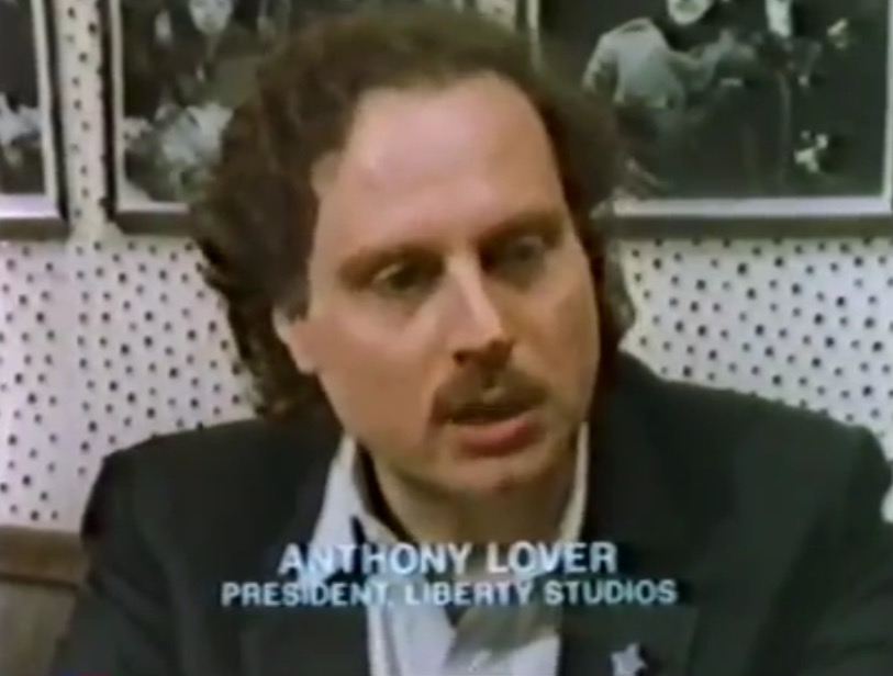
The video (embedded above) is about 10 minutes long and it details the work done on some of the 60 plus visual elements that went into making the intro. The intro was written, designed and shot by Liberty Studios out of NYC headed up by company president Anthony Lover (wow, what a name!)
Their idea was to create a look and feel to the HBO brand that really set it apart from anything that had previously been on TV or cable by metaphorically bridging the gap between the cable company and its audience. That’s why the intro begins with a shot looking through the window of a family’s home where they are sitting down to watch TV. The piece starts with us, and then it pans out to a building, then a city street, then a city, the country, the horizon, and eventually into space and the HBO signal space station. By pushing forward even more, entering the giant spinning HBO logo we’re brought full circle into the Feature Presentation animation which is what would be playing on the TV in that first home.
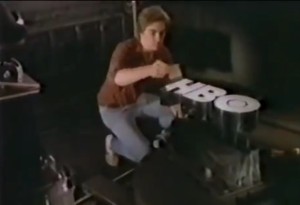
One of the things that really struck me was just how much of this intro was practically shot with actual props, up to and including that brilliant shiny metal HBO logo in space (with a fun practical backlit starburst effect created by David Bruce!)
I never would have guessed that they manufactured that piece out of brass, and now I’m insanely curious to know where that piece is now? I assume it’s in the office of some HBO bigwig, but it’s just as likely in a landfill (I mean, look at where the Deathstar shooting model would have ended up had it not been for my friend Todd over at Neato Coolville, Part 1, Part 2, and Part 3!)
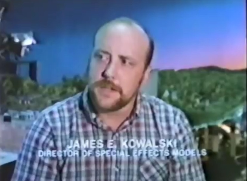
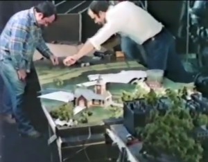
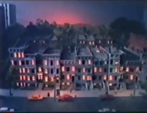
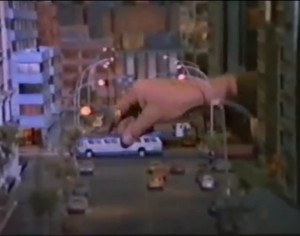
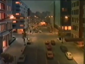
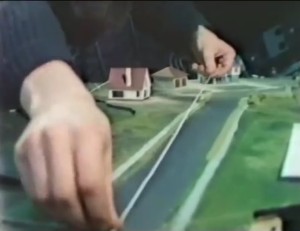
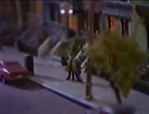
I also think it’s rad that the 6-person model team and the Special Effects Model director (James Kowalski) built and shot a huge cityscape in about 1:64 scale (Hot Wheel car size.)
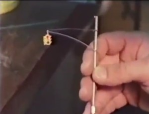
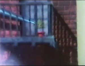
They built all the building facades, trees, lamp posts, and even working traffic lights, as well as putting in a ton of details like potted plants sitting on the fire escapes, the painted lines in the streets and even tiny signs. They went so far to put in working lights in every room in every building and house in the model. Even the headlights on all the cars and buses work. The artists even peppered the city with bums and hookers, so if you have a keen eye and a fast finger for the pause button you can scope some crazy details. Overall the model is about 10 feet wide and 30 feet long. That’s 300 square feet of awesome that took three months to build!
I love that there ended up being so much detail, so many tiny flourishes that caught the eye that they realized in order to make it look real and not fake in a hyper-reality sort of way, they had to pump in smoke to blur the horizon and give the perception of a more natural three dimensional environment. As you travel through the model the foreground becomes crisp and clear while the background stays slightly fuzzy. The effect is pretty damn amazing and points to why practical effects will always trump CGI for realism.
The music for the HBO intro is just as important as the effects that go into the visuals too. The piece was composed by Ferdinand J. Smith and performed by a 65 piece orchestra, illustrating that HBO spared no expense for this short one and a half minute introduction. Also, before I forget and neglect to mention it, the music in this making of video is amazingly reminiscent of the 70s/early 80s Sesame Street music which makes the whole thing that much more fun.
So, if you’re like me and you grew up with your eyes glued to HBO, it’s totally worth checking out this 10 minute making of video. Now, if I could only get similar behind the scenes pieces on the Tri-Star, 20th Century Fox, and 80s era Nickelodeon intros!
