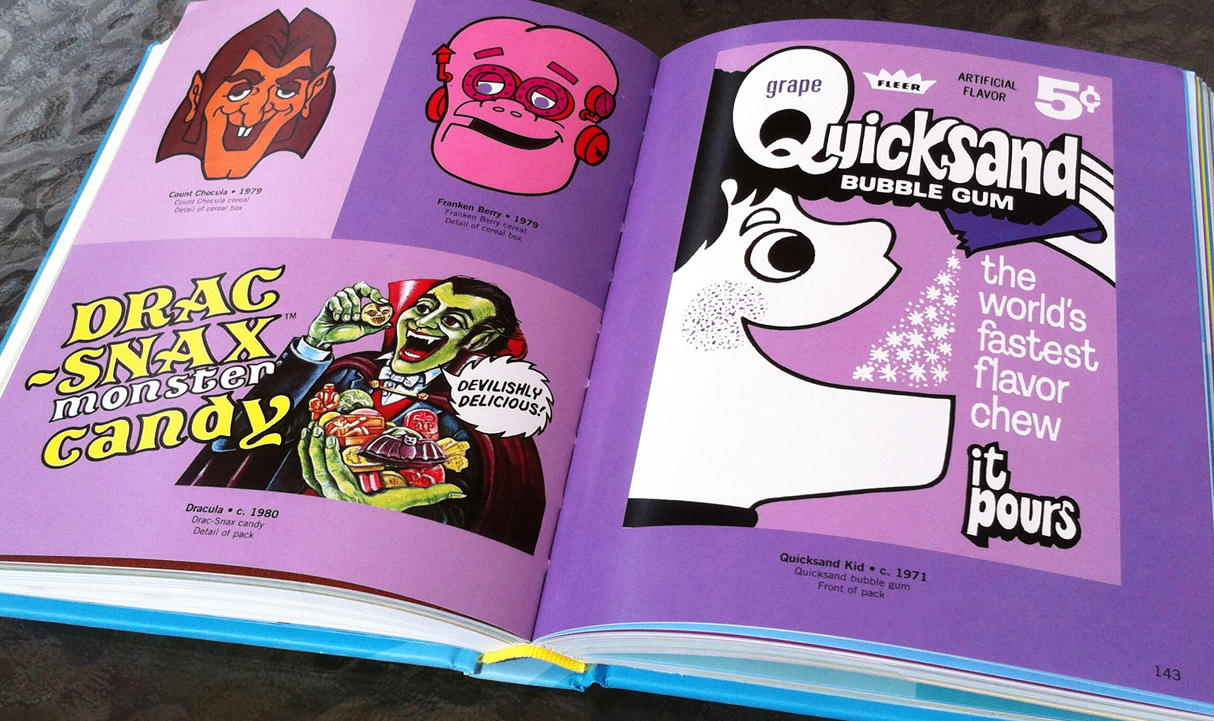
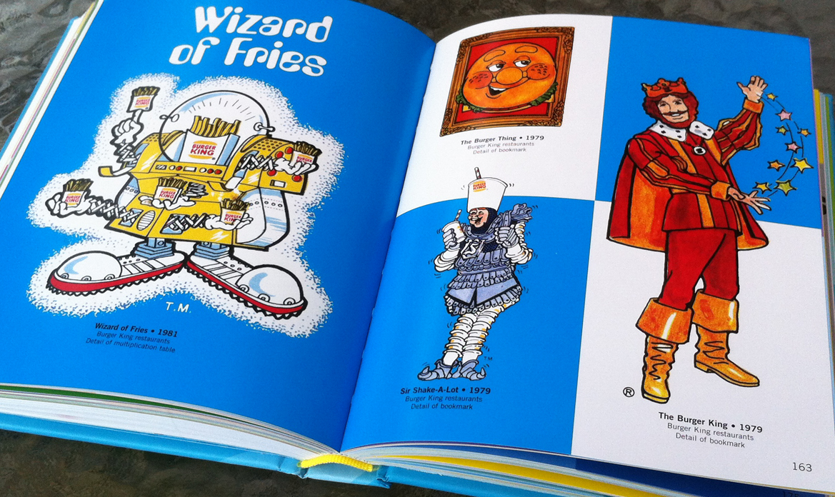
 As a kid I spent a disproportionate amount of time wandering around supermarkets and discount outlets every weekend with my mother. Like most kids my mom would drag me out to the store to do the weekly grocery shopping, but unlike most (I think) my mother usually went out close to midnight and would spent hours picking through the aisles looking for new products and browsing endlessly for stuff. Since I knew she was going to be awhile, it was pretty common for me to wander off, lost in my own head and making up stories as I let my eyes scan across the thousands of boxes, cans, jars, bottles and packaging. Much later I’d come to the realization that this time was her precious escape from the isolation of being a homemaker, her chance to get out and just not be cooped up in the house and the routine.
For me, it was the beginning of what would become a life-long obsession with branding, packaging, and art. Every product on those shelves had a story, many of which even had convenient main stars right there on the box. Tony the Tiger, Cap’n Crunch, the Kool-Aid Man, Big John (he of the beans & fixin’s fame), Mr, Clean, Chef Boyardee,Mr. Bubble, the old timey lady on the raisins box, all of these characters, all of this art and branding was swimming around my head as I tried to keep myself entertained and sane while wandering the aisles, lost in the supermarket.
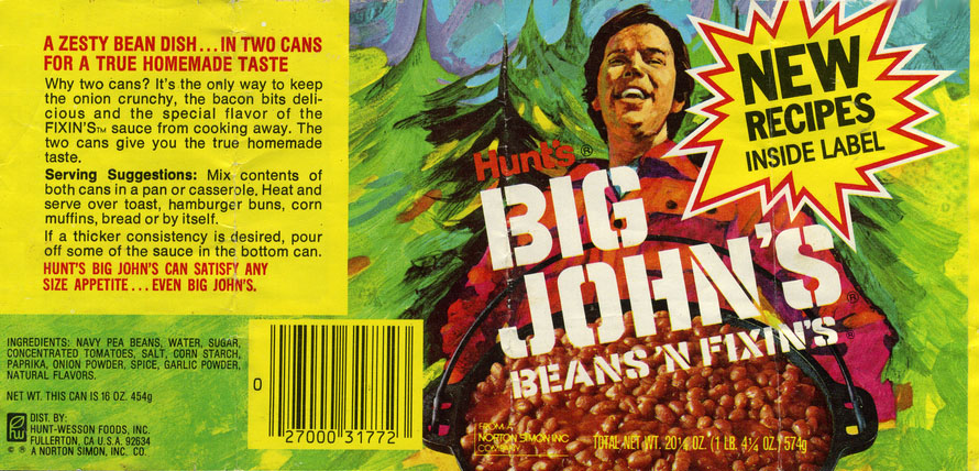
From the collection of Jason Liebig, CollectingCandy.com
This love of branding, product mascots and art was reinforced in my teens and early 20s after I got a job stocking grocery store shelves on the night crew of my local Kroger. Again, to keep myself sane I’d lose myself in the various labels and boxes, making sure all the packaging was upright and facing front at the end of the night. It was very centering in a weirdly zen way, being a sort of shepherd for products, making sure they were presented as they were designed. Again, this just reinforced my love of branding, and has informed my taste when it came to doing my own freelance design and artwork.
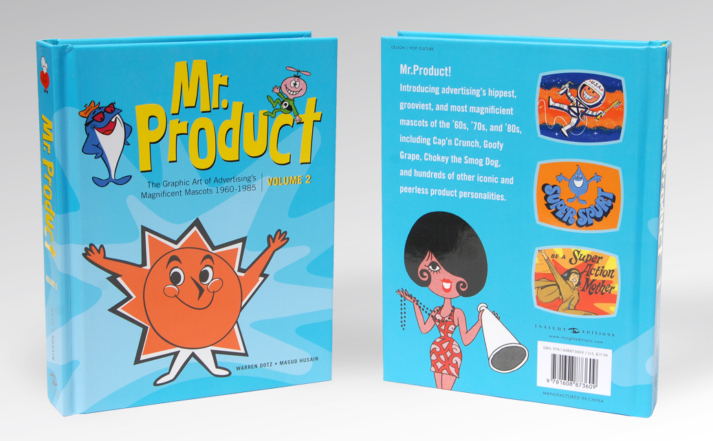
Recently my friend Belle Dee had shared a picture of some books she’d just bought, a couple volumes called Meet Mr. Product and simply Mr. Product, Vol.2, and they really caught my eye. Written and compiled by Warren Dotz and designed by Masud Husain, this two volume set features the graphic art of advertising characters and mascots covering a plethora of brands over the majority of the 20th century. Well, I got my hands on a copy of the second volume and I am in love…
This volume’s 272 pages are crammed full of hundreds of mascot illustrations and paintings mainly covering the years 1960-1985. The book is broken into two halves, the first deals with short essays and examinations centering on the design trends of those two and a half decades. Transitioning away from the Googie futurism of the late forties and fifties, the book chronicles the tumultuous era of design that saw America through the ultra-hip beatniks, flower-power psychedelia, anthropomorphic machines and electronics, the surf, mod, and monster cultures and on to the ultra-weird Sid & Marty Kroft-inspired McDonalndland gang, the salacious playboy and disco era, and eventually to the height of product merchandising in the Regan era. I really enjoyed reading through these micro-chapters. They’re not only fun and conversational, making connections between mascots and trends, but they lay the groundwork for really appreciating the second, larger half of the book which focuses solely on on the advertising mascot artwork.
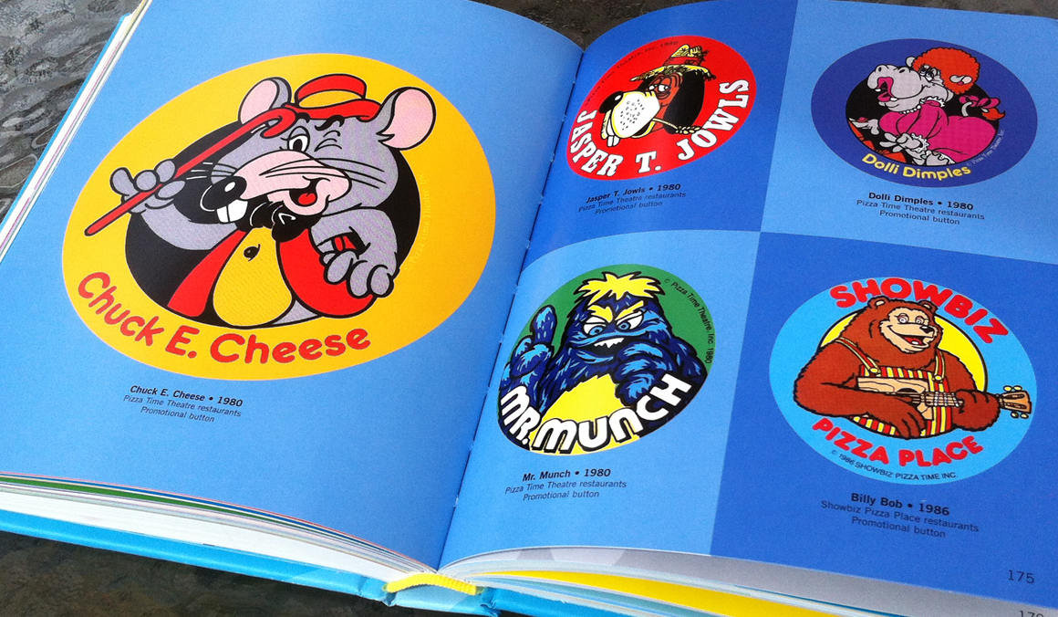
As much as I enjoyed the first 80 or so pages of examinations, it’s in the last couple hundred pages where I fell in love with this volume. The artwork is broken down into 7 sections, Food & Drinks, Kids are King, Fast Food Franchises, Car Culture, Modern Life, Travel and Amusement, and Public Services and Safety. Inside these chapters each two page spread is a curated collection of similar mascots, be it because of design or sub category. For example, in the Fast Food section there’s the wonderful couple of pages that feature early illustrations of the Chuck E. Cheese and Showbiz characters (in this case using imagery from various promo buttons as seen above.)
The pages above also underline another aspect that I really love about his book which is that there was a lot of time and care taken with the artwork to showcase the actual illustrations as they were originally designed. At first this might seem like a pretty simple thing, but I know from 10 years of sharing ephemera on this site that it requires a lot more than just snapping pictures or scanning old packaging or items. There was a tremendous amount of care taken with cleaning up the artwork so that it could be presented in a very crisp and clean fashion enabling the reader to fully appreciated the design which I love. It’s this attention to detail in the presentation that makes this book an indispensable resource for graphic designers, both for inspiration and research.
Another aspect that I was very pleasantly surprised by was the sheer volume of mascots and characters presented. Being a collector myself and having been steeping in this world for over 30 years you get to a point where it feels like you’ve seen it all. Even though I was born around the middle of the period this book covers, I’ve spent years thumbing through old magazines, deconstructing the products found in the backgrounds of old movies and television shows, and scouring the internet for examples of product packaging and I still was only familiar with about half of what’s presented in Mr. Product. Flipping through the book I noticed a mascot I that looked sort of like the Fruit Stripes Gum Zebra, Yipes, but was instead the Beech-Nut Gum-Fetti Giraffe. Turns out the two were both offshoots of the same company and might be representing the same gum, but this is something I never stumbled across in 30 years of paying attention to this kind of stuff.
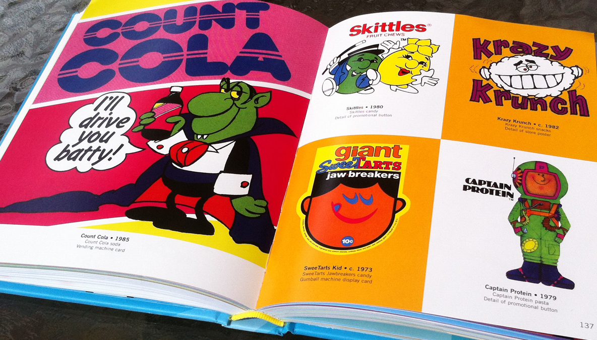
In the photo above you can also see a really cool piece of artwork for Count Cola. Again, longtime readers of this site know that I adore Halloween and monster branding, and I hard never stumbled across that particular brand of cola or its awesome cartoon vampire mascot. I even Googled it, looking for pictures or info about Count Cola and was only able to find one tiny pixelated illustration, so this book has some really great obscure artwork from Dotz’s collection.
If you’re a fan of design, product branding or artwork, the Mr. Product books should be mandatory purchases. Not only will they provide a wealth of inspiration, but for those that think they’ve seen it all, I’m pretty sure this book will prove otherwise and be a very welcome addition to your collection. Dotz and Husain have really outdone themselves with this volume and as soon as I started flipping through the book I immediately logged into Amazon and ordered the first one as well. My hope is that sometime soon the duo will reconvene and put together a third volume that covers the latter half of the 80s and the 90s to finish off the archive of a century of advertising mascots.
